MOBILE / UX / USER RESEARCH
Feedback Studio for iOS
Creating a universal app to support multiple user roles and adaptive layouts across iOS devices.

Part of the Club… Kinda
It was 2014, and we felt triumphant. Turnitin had just released its first iPad app, and we felt like we had finally made it into “the club.” At last, we could say we had a true mobile presence.
Feedback started pouring in, and teachers expressed how much they loved the flexibility of grading on their iPads. It felt lightweight. No lugging around heavy stacks of papers, and they could grade anywhere, even offline.
However, interspersed with the positive feedback came a flickering of critique.
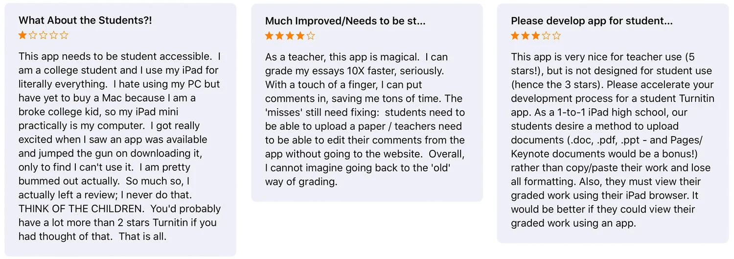
"What about students?!"
Screech!!! You know that moment in the movie where the tires screech, and everything comes to a halt? While we hadn’t forgotten about students, we had decided to only focus on teachers first. There was no denying that there was a demand for student support on our mobile app.
THE CHALLENGE
Building the Student Experience
Fast forward to 2016…
The opportunity to integrate the student experience into the app had arrived. The goal was to start off simple and focus on students’ key goals—submitting work and reviewing feedback.
We started by thinking about how to incorporate these interactions into the existing iPad app. We wanted one universal app for teachers and students as opposed to multiple apps, so that we could maintain the app in a practical manner. We knew that upon authentication, we could detect teachers from students and present role-specific interactions.
Partnering with engineering, we worked side-by-side to plan the navigation structure for students.
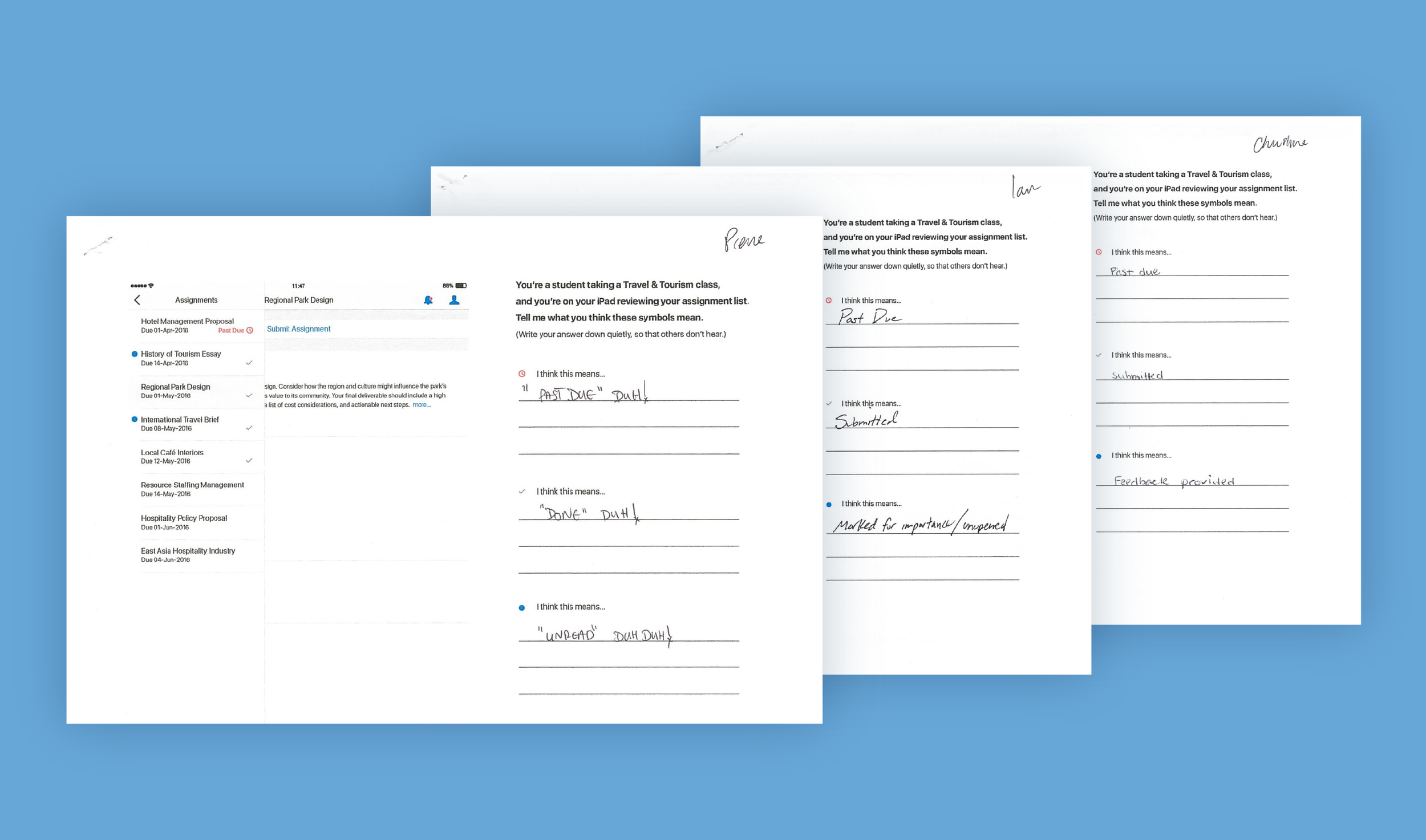
Once we had a general sense of the major areas we needed, we continued by sketching out more detailed interactions for student submission and review of teacher feedback. We then conducted remote and onsite usability testing to ensure the experience was intuitive.
Informal testing helped to uncover basic usability issues.
OPTIMIZING MAINTENANCE
Adaptive Layouts
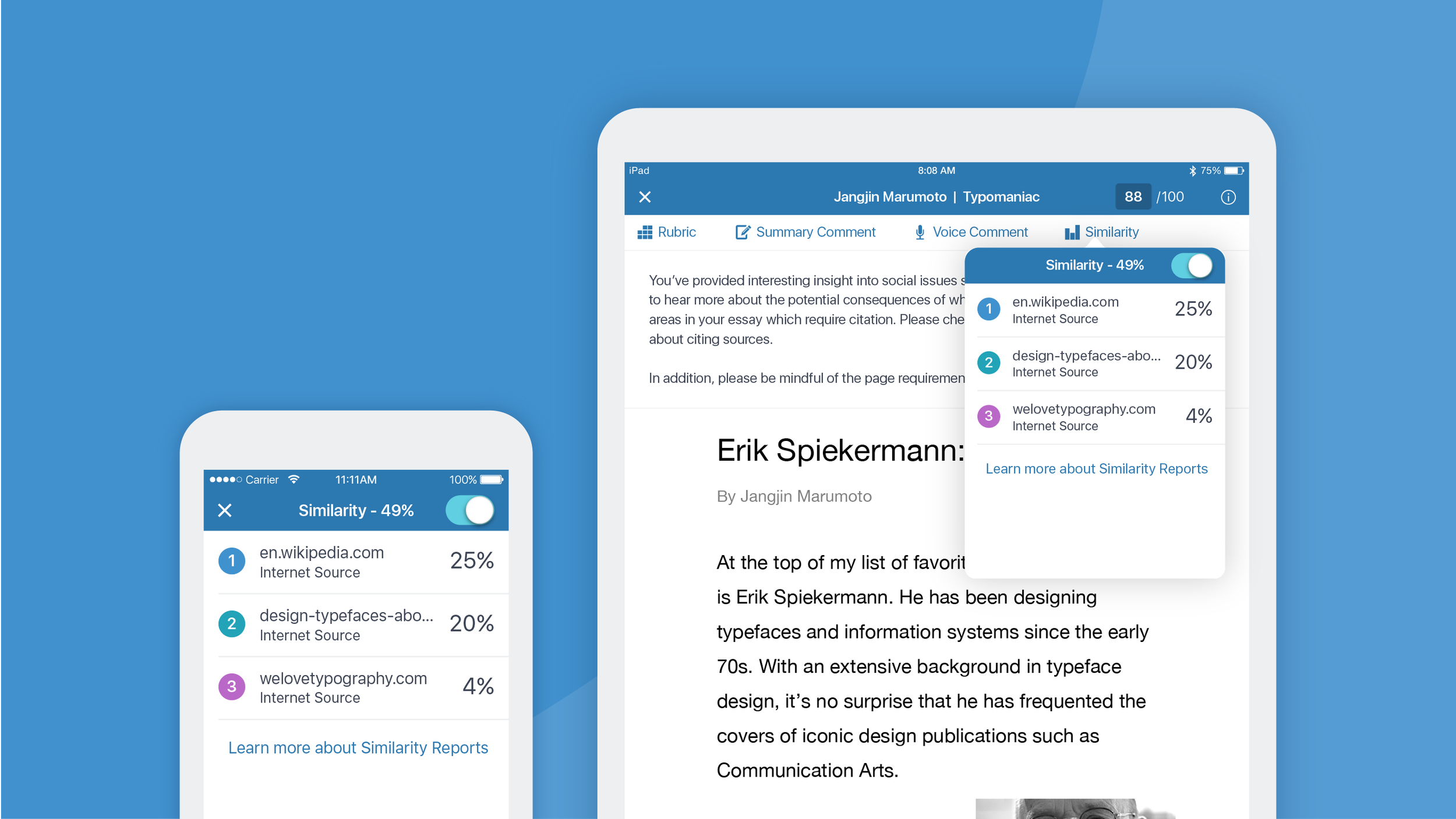
Our next goal was to shift to an adaptive layout which would allow us to have one universal iOS app supported on both iPads and iPhones. For teachers, we understood they preferred grading on iPads. For students, our research revealed that iPad usage was quite a bit lower. Rather, we believed students would be much more likely to use the app on their iPhones.
We started by evaluating the navigation structure for both teachers and students. Working with our product team, we agreed that the common denominator for both teachers and students revolved around submission and feedback.
Working to consolidate tasks into logical groupings, we trimmed extraneous actions and carefully reviewed organization of actions. We wanted to ensure everything was organizationally sound.
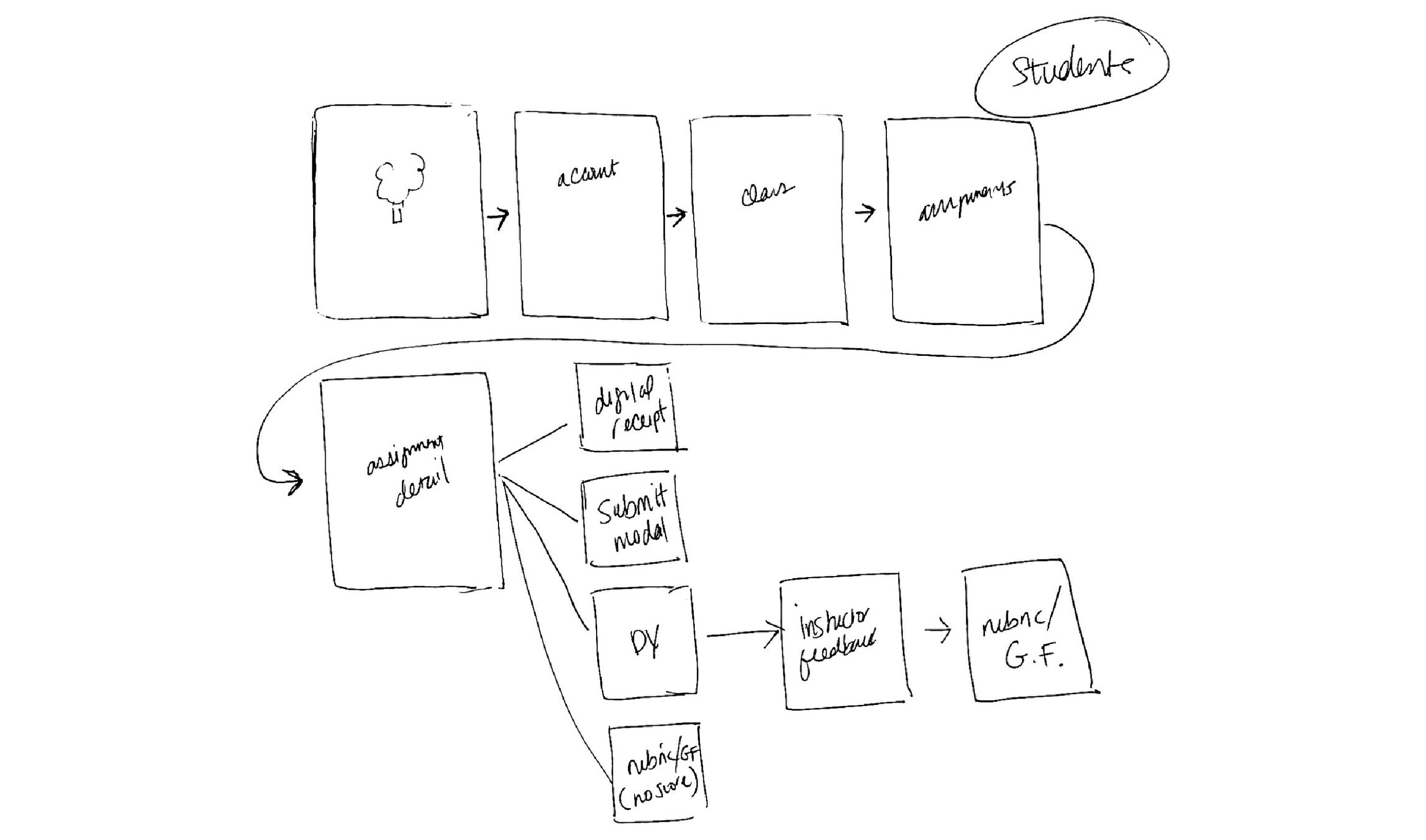
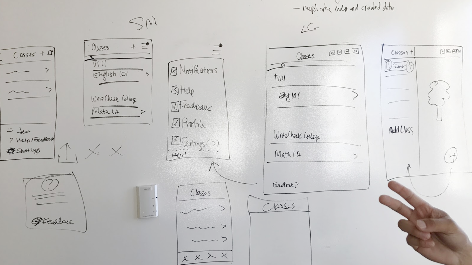
We sketched the navigation flow of our app on a whiteboard to ensure the plumbing was technically sound while still keeping usability top of mind.
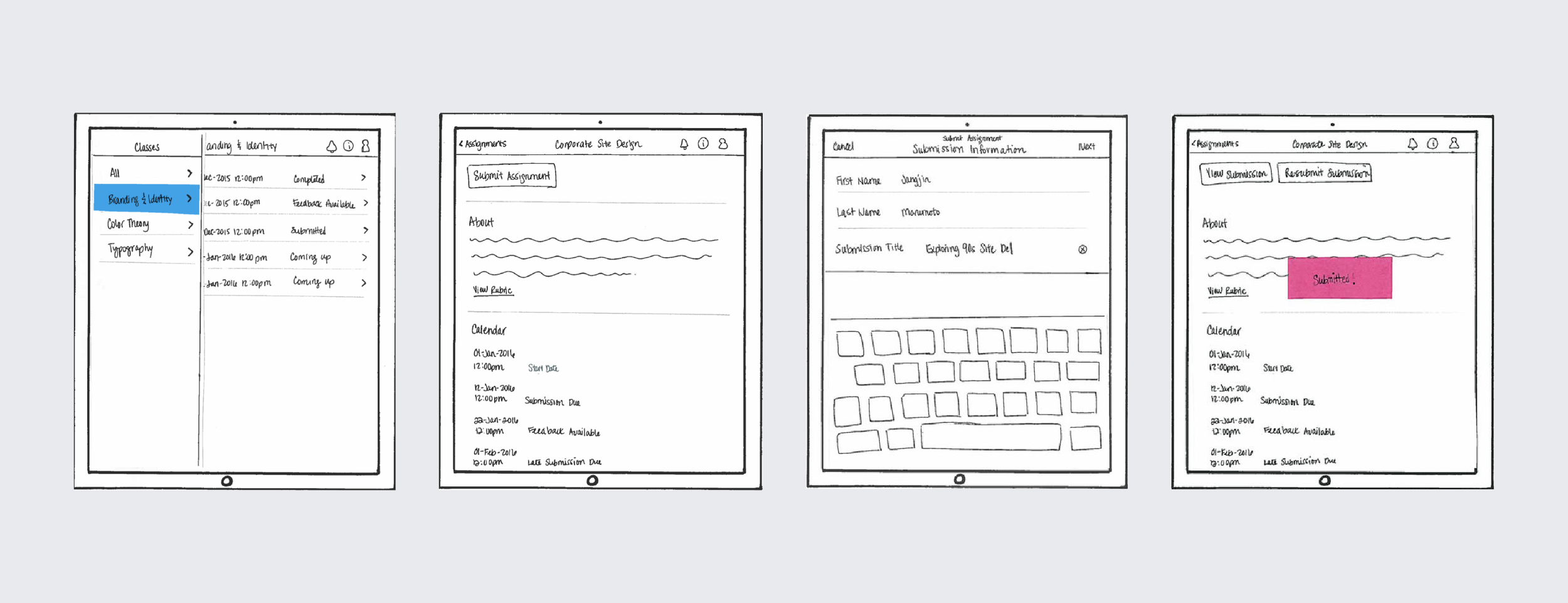
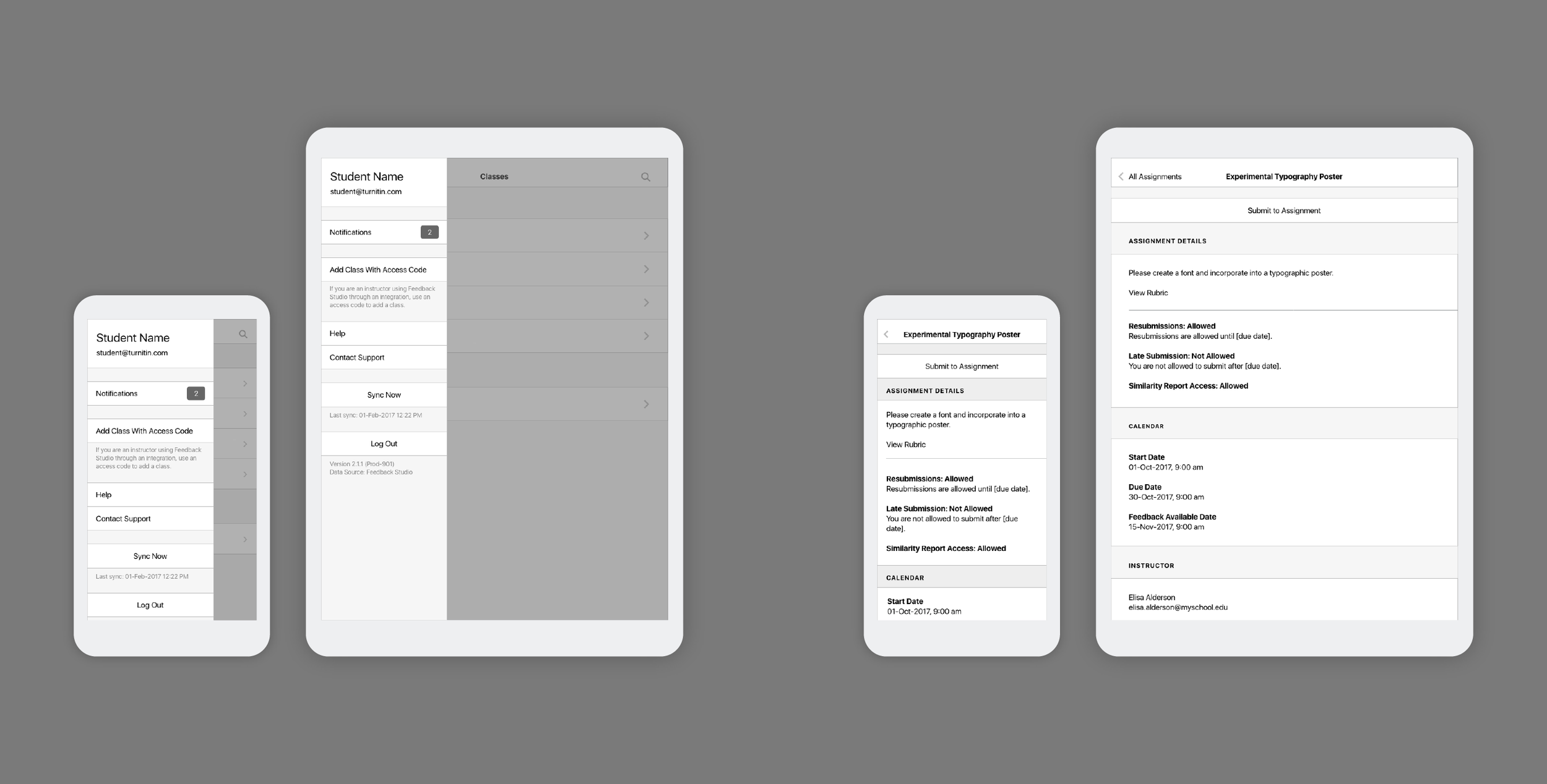
Next, we started to think more about details. We shifted from sketch to wireframe and considered how to present specific information to students and teachers.
As we got deeper into the design, we transitioned from sketches to wireframes.
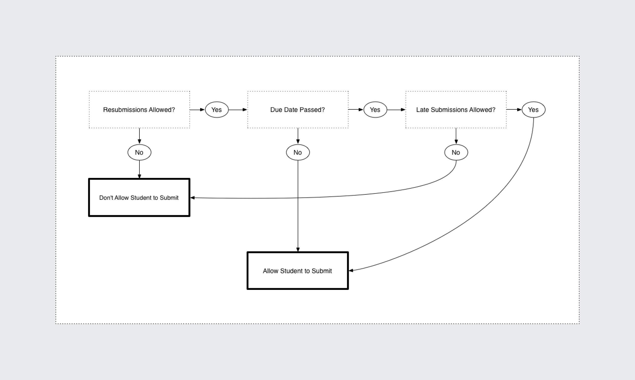
As we progressed deeper into the project, we worked through various detailed workflows to determine which UI to present to users given different states.
Diagram used to communication submission status
USER RESEARCH
Applying Lessons Learned
We knew from past interviews with teachers that student discoverability of feedback and grading would be key. Teachers expressed grief over spending their nights and weekends grading only to have students not read their feedback! The last thing we wanted to do was make a casual design decision that would increase a barrier between teachers’ feedback and grading to students.
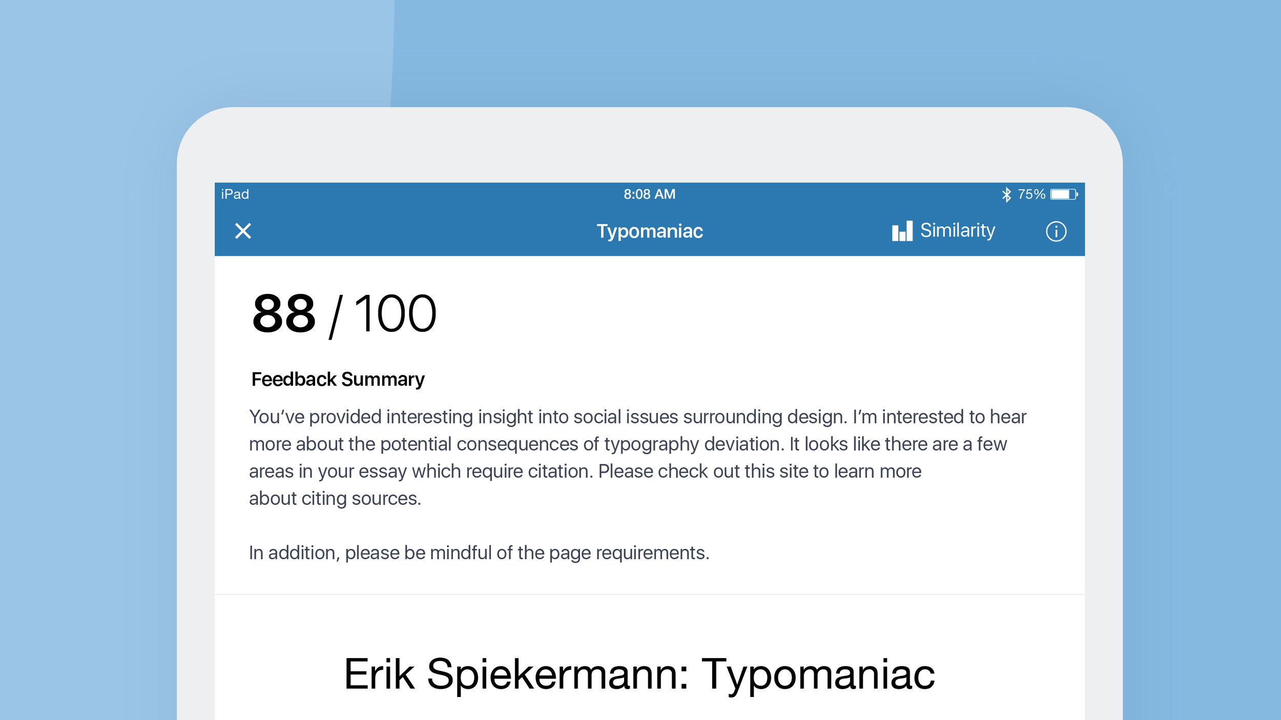
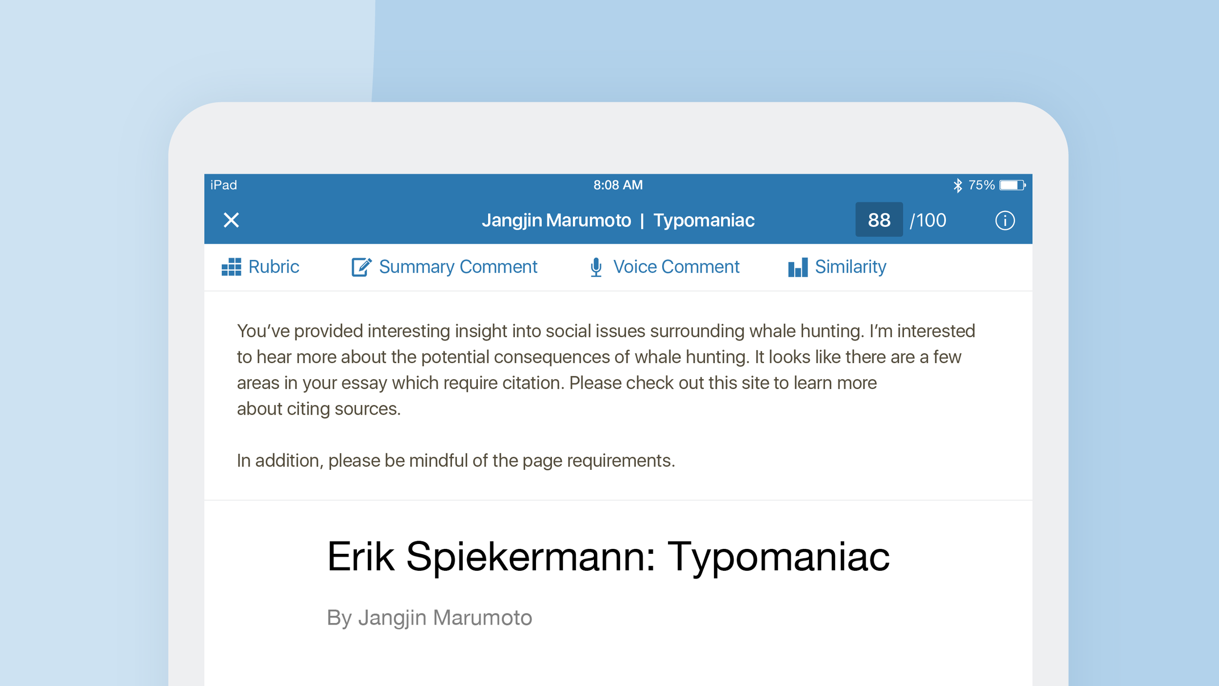
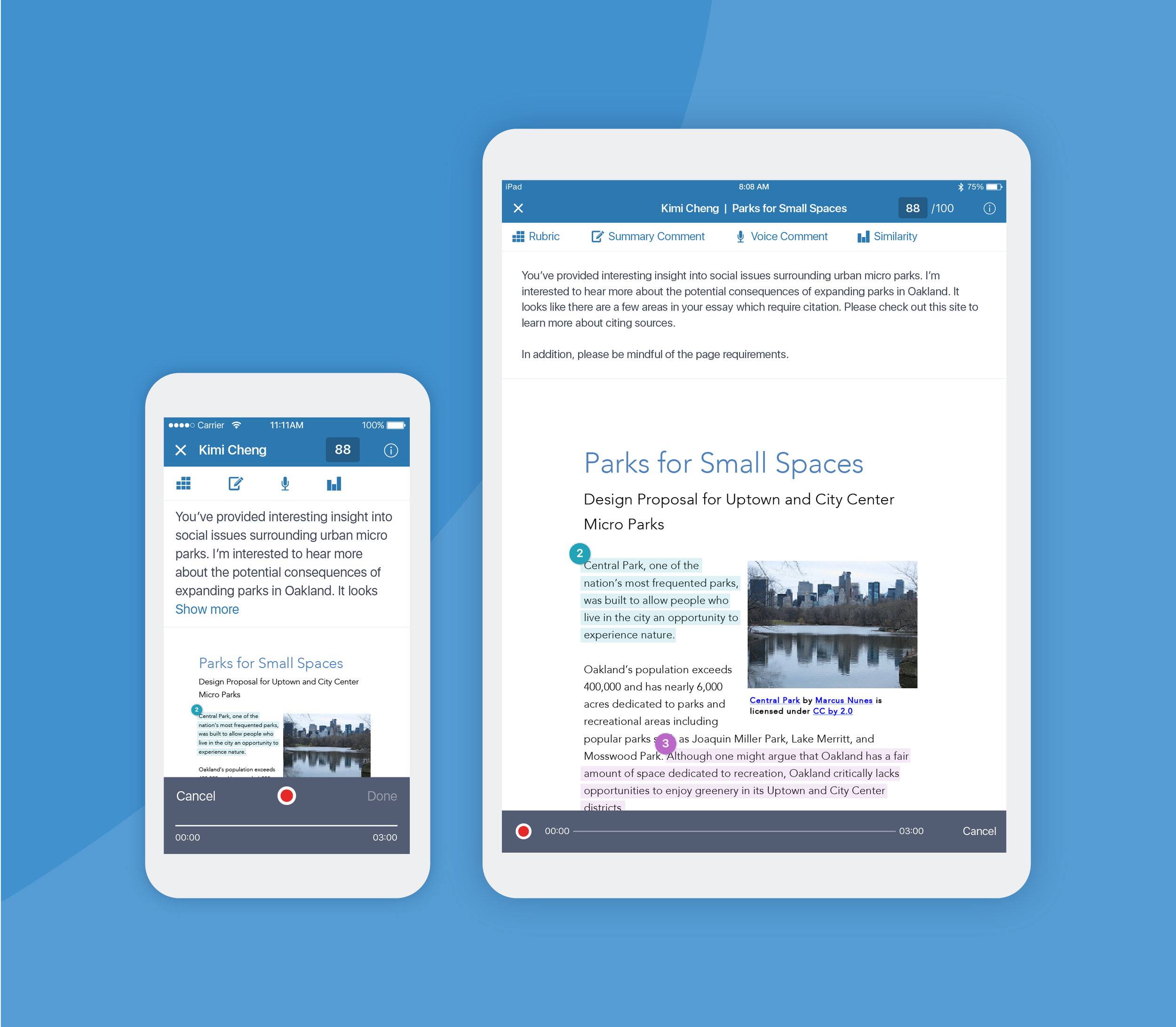
To improve students' discoverability of feedback, we displayed the grade, summary comment, and rubric at the top of of the screen, so that it would be the first thing shown upon opening their paper. If a voice comment was included, we also immediately expanded this on the screen to prevent students from missing their feedback.
For teachers, we knew from previous user research that discoverability of tools and extra taps were problematic.
To address this, we consolidated all primary actions into a toolbar which was displayed immediately upon opening a paper. This eliminated up to two taps!
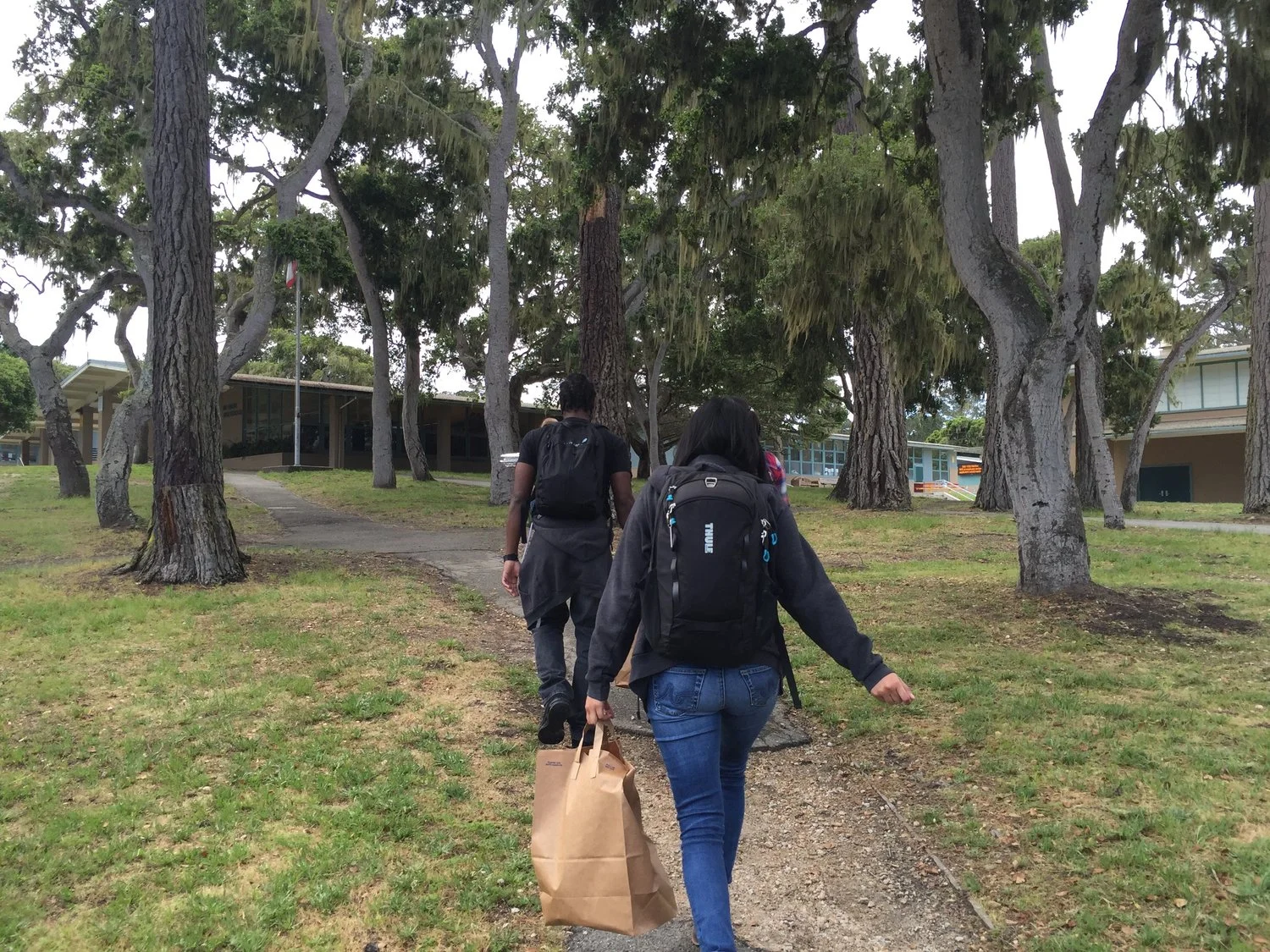
Our team continued field research at local schools.
RELEASE
We're Ready
After several rounds of iteration and usability testing with teachers and students, we were finally ready. We released the updated app in July 2017 which included enhanced support for both teachers and students, in addition to support across both iPads and iPhones.
Lessons Learned
Think about the full ecosystem with all of its users and their goals. This sounds overwhelming, but in retrospect I wish we had designed the student experience along with the teacher experience in the very beginning. Even if we didn’t fully develop both at the same time, I believe drafting a plan for it would have served us well later on.
Secondly, work iteratively to reach your goals, while keeping the high level end goals in mind. By breaking down big goals into smaller goals, we were able to take small focused bites into the work without losing focus. Moreover, having a vision for the future allowed us to plan the foundational plumbing better, preventing us from negating significant amounts of work.

Browse
All Projects
Next Project
Admin Stats

