It’s rare to get a second chance to rebuild something from the ground up.
Elevating our products to meet WCAG 2.0 AA compliance was a major initiative at Turnitin. Though we had made great strides improving the accessibility of our flagship product, there were still major areas to be improved in our Similarity Reports. The most critical problem was rooted in our inability to announce document structure and similarity matches throughout the paper to screen readers. After weighing out the options, we had hit a dead end.
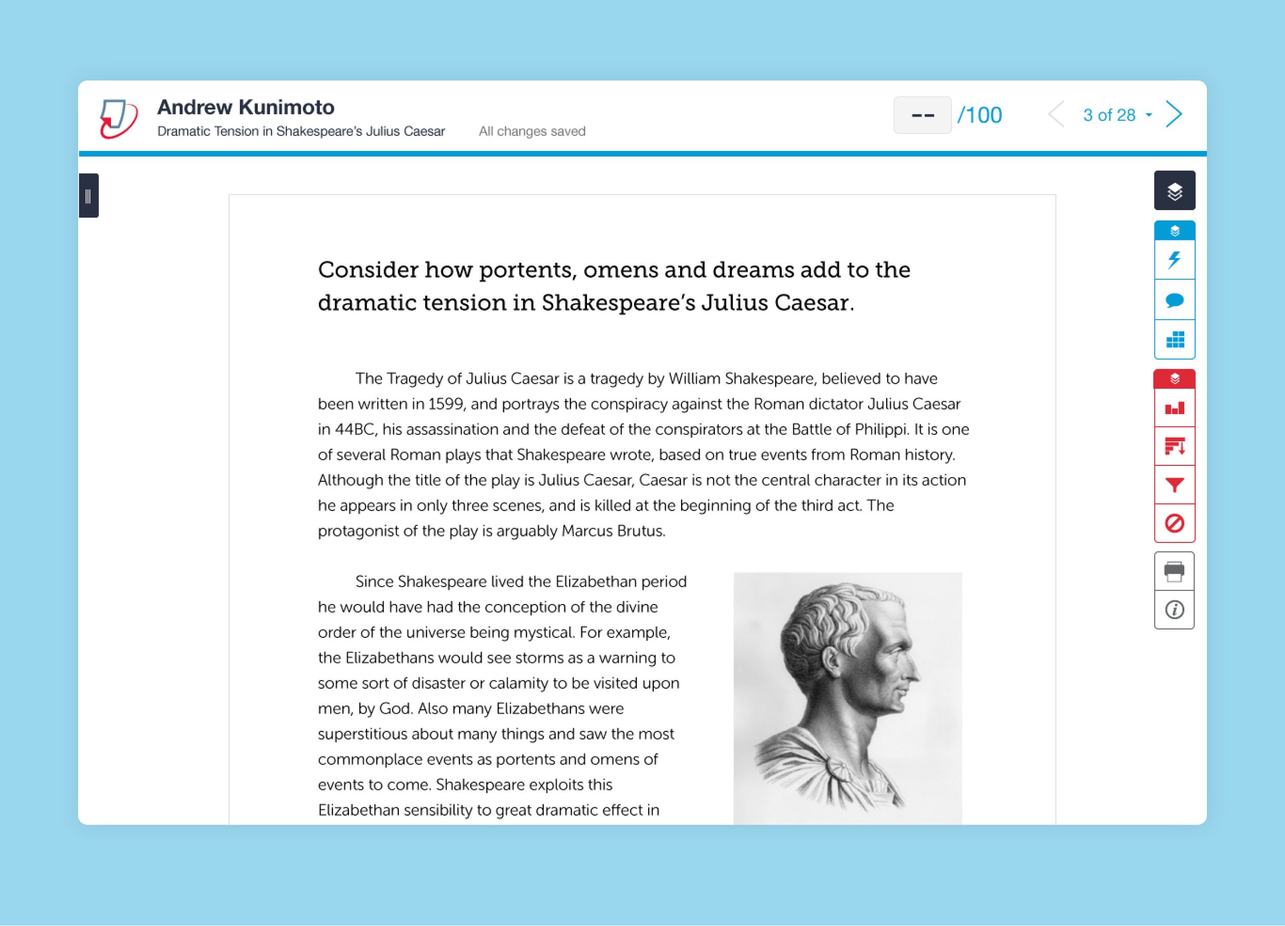
Original Similarity Reports were not screen reader accessible.
In 2016, we were presented with a rare opportunity to completely rebuild our Similarity Reports. Fortunately, many of us worked on the earlier iteration of the product, so we were already familiar with the accessibility challenges we ran into into before.
We were determined to not repeat the same mistakes again.
Working with a small, cross-discipline team including engineering and product, my role was to lead the redesign of our Similarity Reports with special focus on improving screen reader accessibility.
While we had some experience, there were still big questions to answer.
How do you translate the visual experience into an audio experience?
How do you make the app skimmable and easy to use while retaining all of the same information?
How do you communicate dynamic changes in the app?
We had a few ideas.
In earlier testing, we had observed the way screen reader users scan and navigate by lists of headings and regions. To communicate the visual layout and overall organization of the app, we would use headings and regions.
Next, to indicate the similarity matches within a document, we would include announcements inline with the original text.
Finally, we knew from experience that it would be key to get early feedback on our approach. We agreed to develop the smallest thing first and then test iteratively to refine.
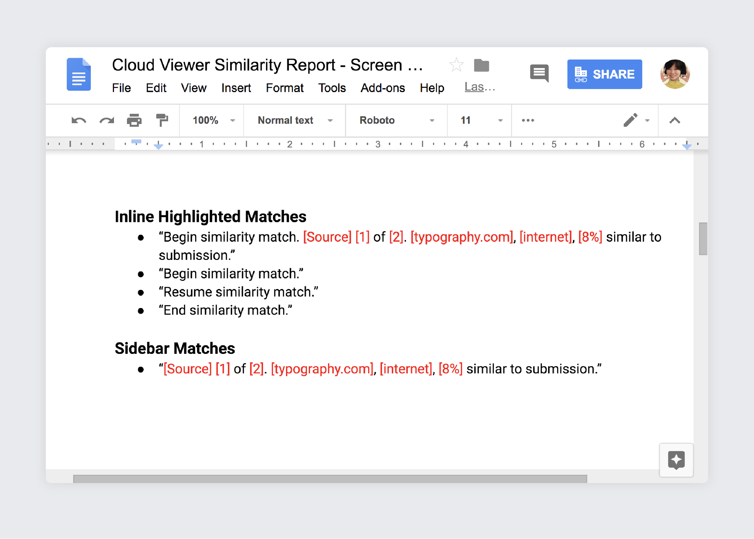
Our first draft of screen reader text started in a Google Doc.
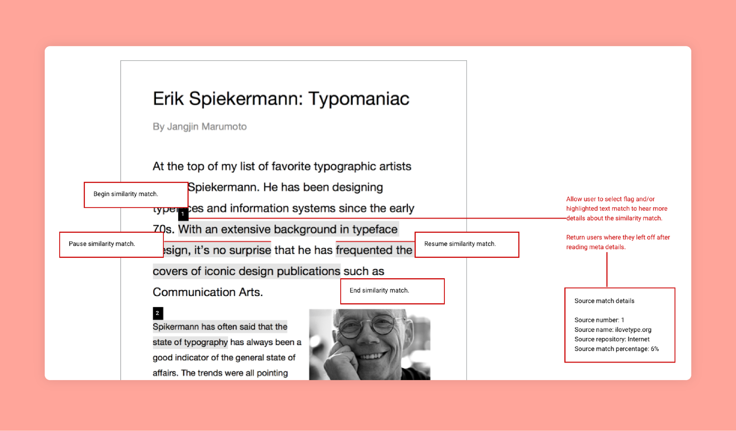
We started in a Google Doc where we drafted screen reader announcements for inline similarity matches.
From here, we created annotated wireframes as a communication tool to help others within our team understand the targeted experience. We felt clear communication would be key. The wireframes helped to connect the visual experience with the audio experience.
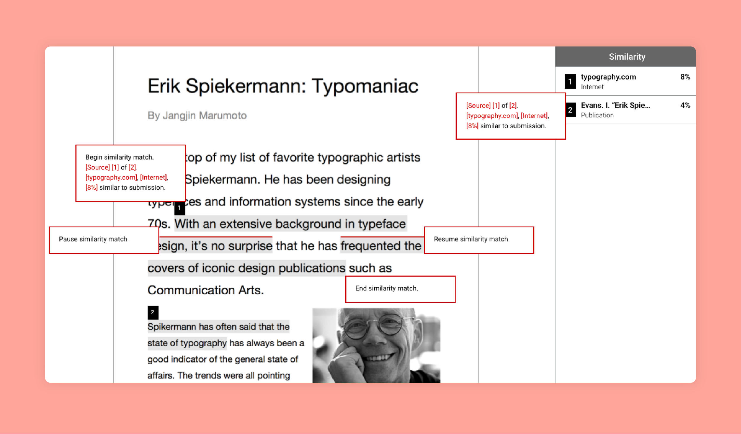
Our initial wireframe helped to connect the visual experience with the audio experience.
At this point, we were still uncertain about how to best communicate dynamic changes, but we felt it would be a solvable problem. We decided to keep moving.
To test our approach, we wanted to use the most lightweight effort. Rather than building a fully interactive app, we started by testing static markup. We created five different prototypes which we tested internally using VoiceOver. After a bit of back and forth, we chose one prototype which we felt worked best. We brought in our accessibility consultant, a top expert in the field, so that she could test our prototype.
Our accessibility consultant tested our static prototype using JAWS and NVDA. She gave us her usual tough love. While she confirmed we were on the right track, she also gave several suggestions about areas that could be improved.
Most notably, the similarity match information was descriptive but overly verbose. It was hard to listen to. In addition, we still didn’t have an answer for communicating dynamic changes in the app.
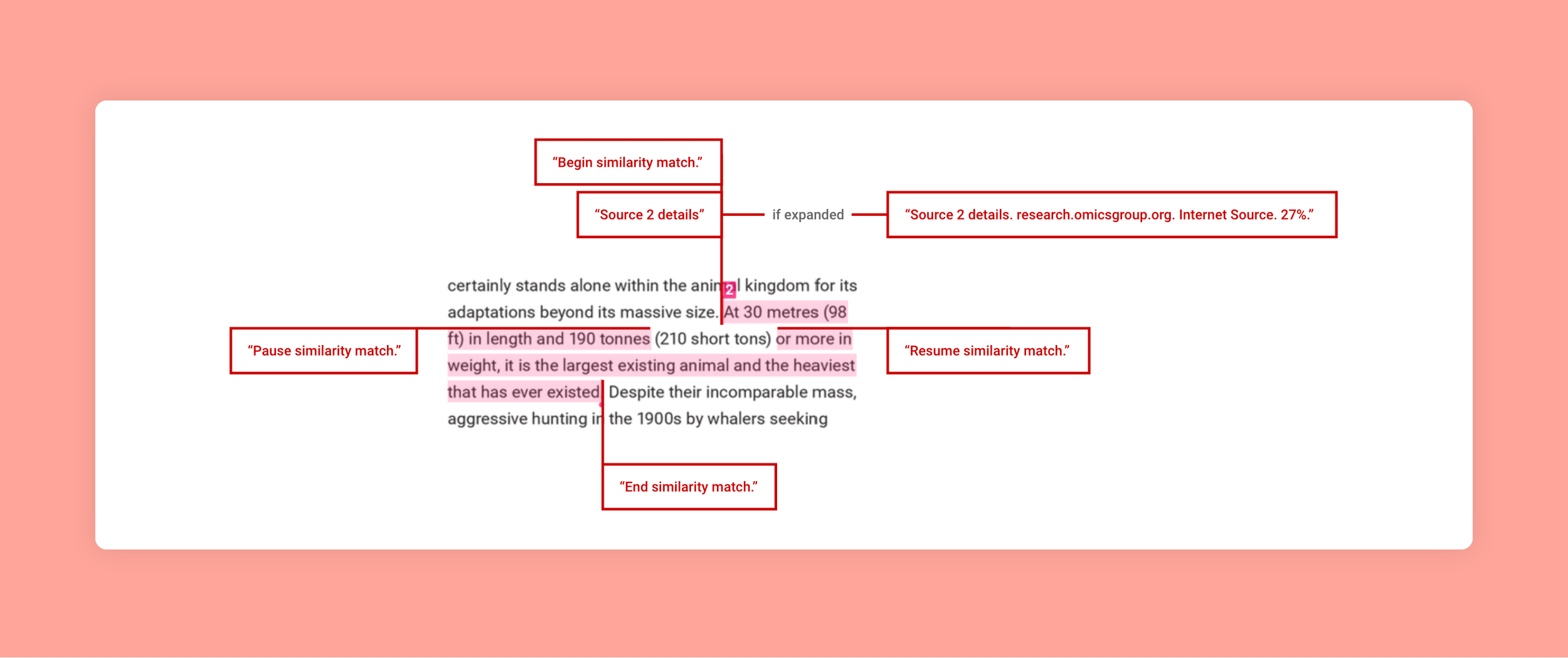
We revised the similarity match information, distilling it down to its most concise form.
We simplified the screen reader text and tried aria-live to announce details.
To address dynamic interactions such as reading match details, we wanted to try aria-live for screen reader announcements.
After some tweaking, we were ready to test again. This time we were feeling more confident, so we deployed code to a dev environment for another round of screen reader testing.
We brought in our accessibility consultant again. She felt the similarity match information was easier to listen to and comprehend, however she felt disoriented by our use of aria-live for announcing match details. She explained that she was losing her sense of place within the structure, and she suggested revealing details through use of a toggle which could expose and hide additional information.
We had also implemented optimizations in the code, targeted specifically for screen readers. This was a controversial topic, as we had heard in the past that it’s a no-no to have separate versions for accessibility. We felt that simply respecting semantic structure resulted in fragmented screen reader announcements. Our consultant assured us that the optimizations were indeed an improvement.
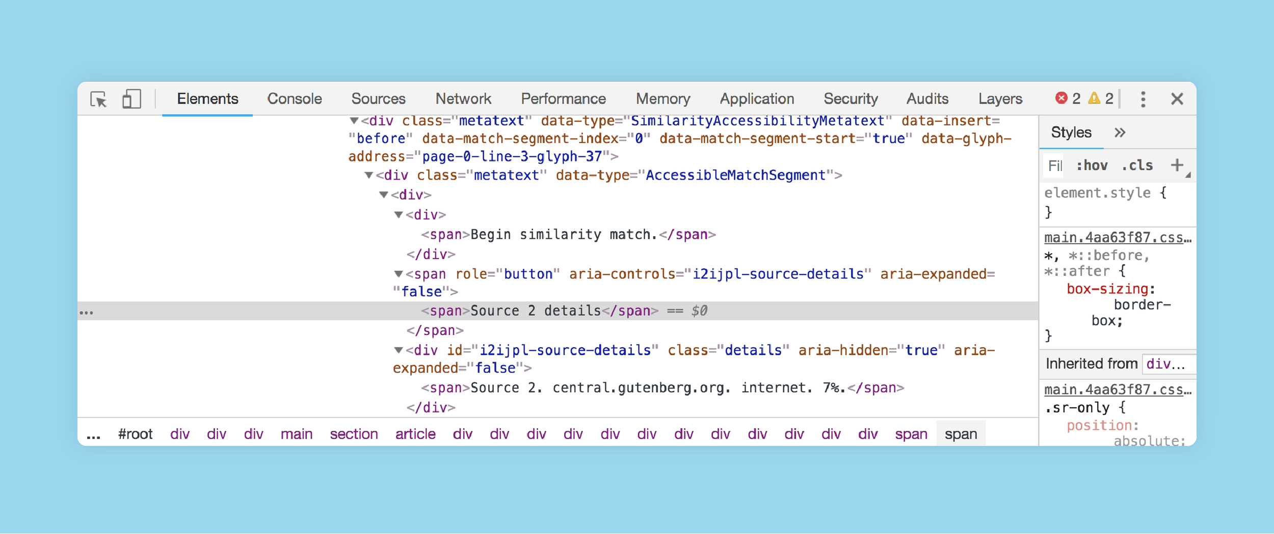
We optimized our code to allow for an optimized screen reader experience.
At this point, we could feel the momentum in the air.
Over the following weeks, we hardened and refined the app. I sat next to our engineers and fine tuned the interactions with them. Our product manager closed his eyes as he listened to the screen reader announcements.
We felt ready.
We shipped our newly redesigned, accessible Similarity Reports which were met with enthusiasm and praise. It was a major victory. Our lead engineer, James Chao, presented our approach at Accessibility Camp Bay Area to share our findings with others and seek additional ideas.
Get feedback early and often. Our lightweight approach allowed us to test many options quickly at low cost early in our process. Fail fast!
Don’t be afraid to break the rules when you need to. We optimized code for screen readers despite going against the standard accessibility guidelines.
Focus on the user experience. Rather than thinking of accessibility as a strict checklist, we considered the real, everyday user experience and strived to make it a first class experience.