WEB APP / UX / USER RESEARCH
Comment Redesign
Shifting the narrative to redefine our position in online grading for the EdTech industry.

BACKGROUND
Product Overhaul
It was fall 2014, and Turnitin was preparing its first major release in four years. Up until this point, Turnitin was mostly recognized for its similarity checking capabilities. We wanted to shift the narrative and become a more comprehensive feedback and grading solution in the EdTech industry.
I stepped in midway during the project as the lead designer. Working alongside our product manager and engineers, my role was to finish the design of remaining features and get the product ready to ship.
As part of our overhaul of the product, we wanted to redesign our commenting features. Our two main commenting features included the following:
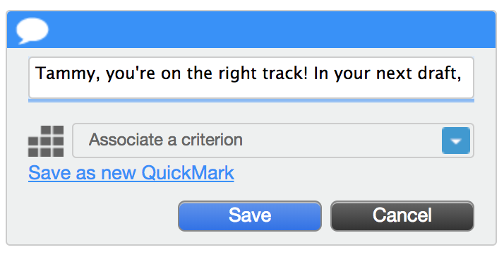
Bubble comments: Free form comments.
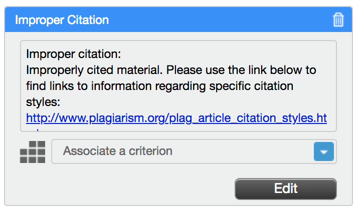
QuickMarks: Reusable comment templates.
THE CHALLENGE
Discoverability Issues
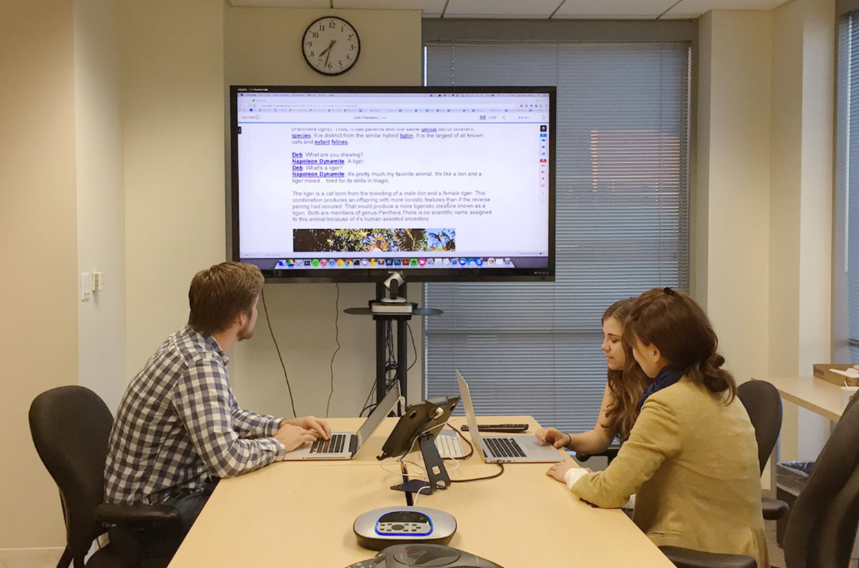
In partnership with our product team, we recruited teachers to try out our new app through usability testing.
Usability tests were conducted onsite and remotely with participants.
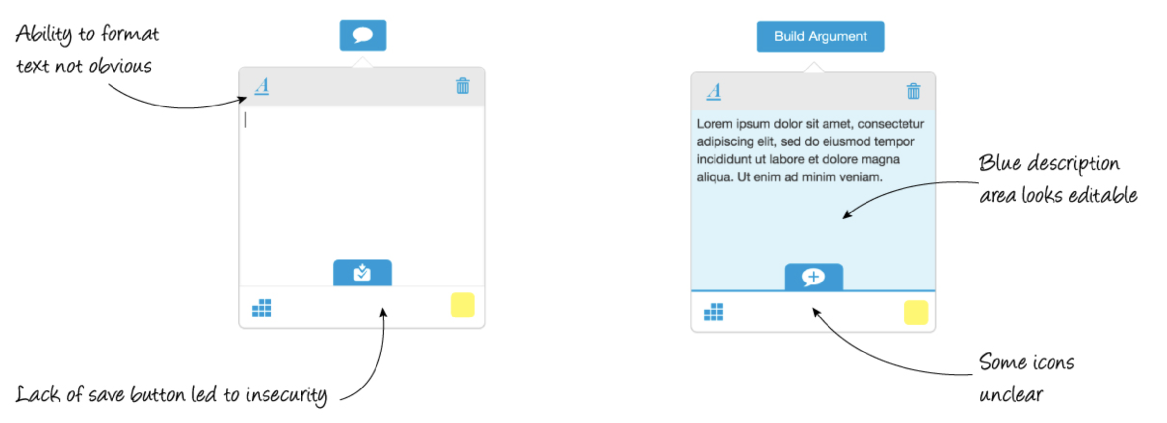
It quickly became evident that the new features we had worked so hard on were getting lost in the shuffle.
Participants did not discover the new formatting options toolbar.
Participants were trying to edit areas which weren’t editable.
Iconography was unclear.
We were racing against deadlines, and negotiating time extensions with stakeholders was tough. They didn’t want us moving backwards to rework features which were seemingly fine. However, we persisted. We understood that commenting was the bread and butter of our product offering, and we wanted to make the most of the findings from our usability testing.
THE APPROACH
Early Concepts
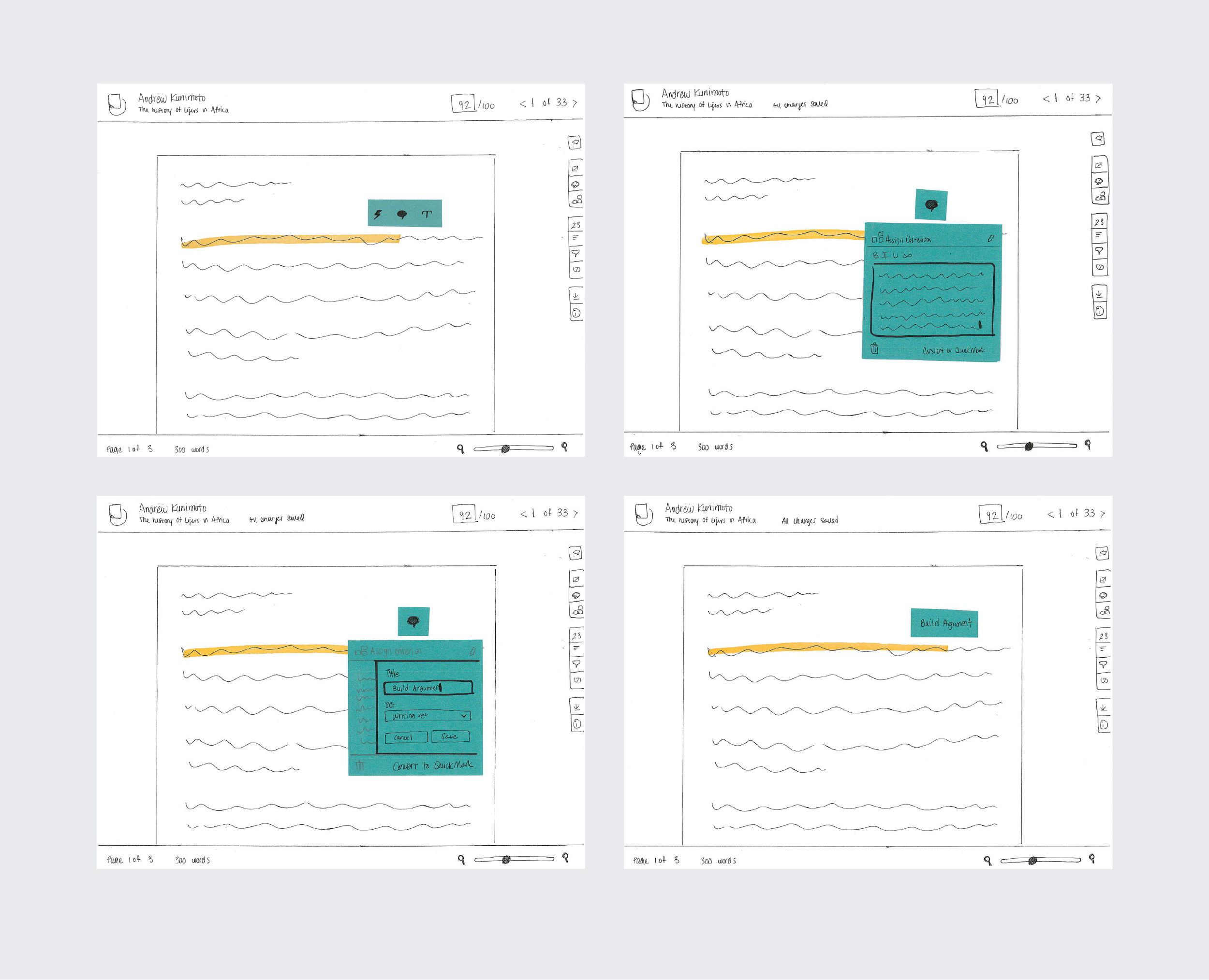
We got to work. We started sketching and creating prototypes for another round of usability testing.
Early sketches illustrating comment interaction
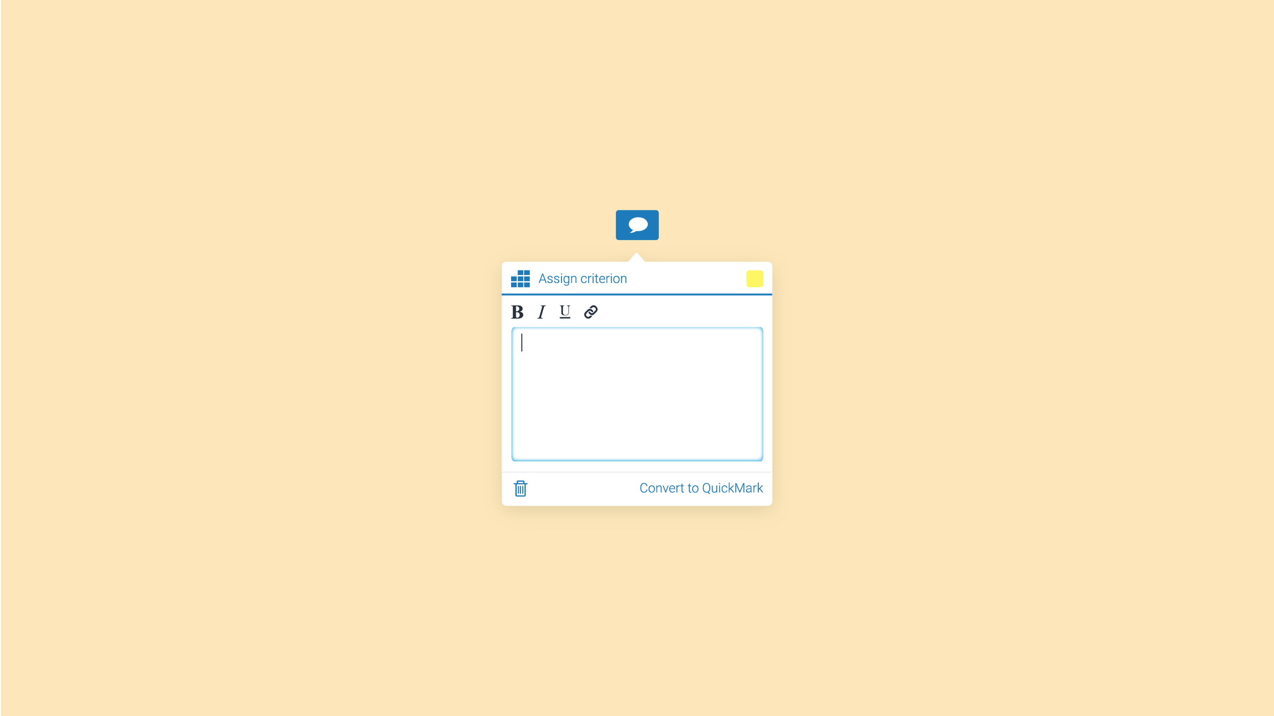
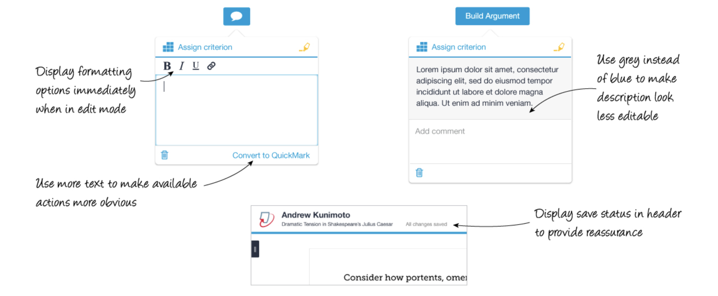
To make the formatting options more discoverable, we made the toolbar immediately visible for comments on focus.
To reduce confusion between editable and non-editable areas, we changed the background color of non-editable areas from blue to light grey.
We experimented with different iconography and use of labels for non-universal actions such as converting comments to comment templates.
In addition, we reorganized the placement of actions based on the hierarchy of actions.
Using clickable prototypes, we recruited another round of teachers to test our assumptions. We had no time to waste and couldn’t afford unnecessary development cycles.
NEXT ROUND
Getting Warmer
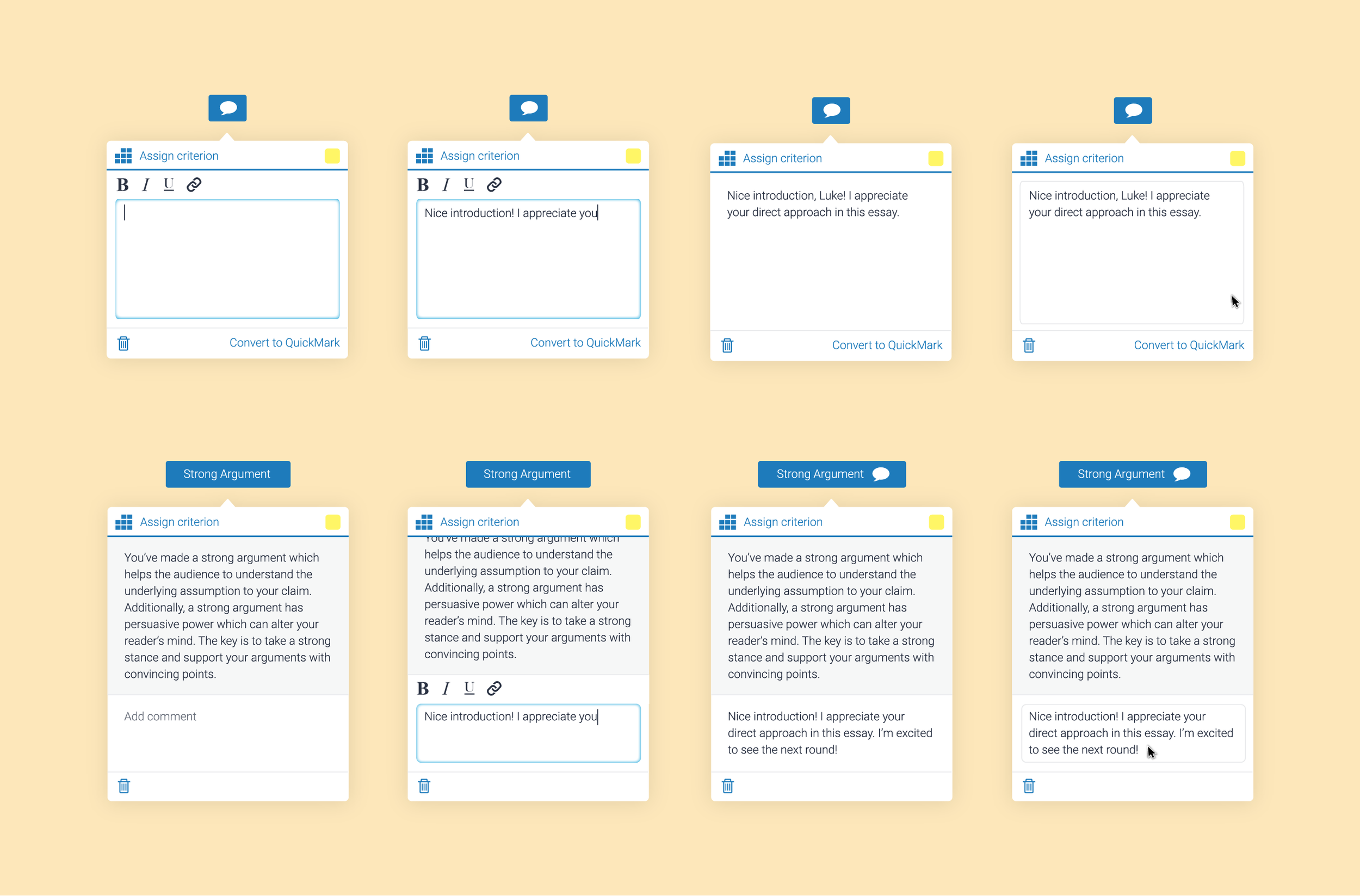
Right away, we noticed participants were discovering the comment formatting options. This was met with delight by participants as they explained how they would link to resources to help explain their comments.
Moreover, by persisting visibility of an additional comment field in QuickMarks, people discovered this more easily.
By simply changing the background from blue to grey, participants no longer attempted to click into non-editable areas of comment templates.
Finally, clarity over actions was becoming clearer by supplementing icons with text labels.
However, there was still some room for ambiguity. Some participants expressed concern over whether or not their comments were being saved.
REFINEMENT
Prep For Release
After zooming back out, we created another revised prototype. This time, we simplified our icons and tested use of a “Done” button to see if this alleviated participants’ concerns over whether or not comments were being saved.
We recruited another group of teachers to test our prototype. The simpler icons were well received. The “Done” button received mix reviews. While some liked the explicit decisiveness of the button, others expressed concern that it made commenting feel harder. They felt it presented an unnecessary extra click to finish their comment, rather than simply clicking outside to save onblur.
We decided to proceed with the prototype without a “Done” button. From here, we refined the comments, thinking through various states from different user role perspectives, i.e., from an instructor versus student view. We pulled metrics to find the most common comment length and truncated unusually lengthy comments.
In 2016, we started switching customers over to the new product, region by region.
We continued to iterate as we gathered customer feedback, both remotely and onsite in the field.
Lessons Learned
Make key functionality immediately discoverable, at the right time.
For non-universal concepts, consider using both icons and text labels.
Get feedback early and often! Make the prototypes lightweight, so that they can be produced as quickly as possible, and don’t get emotionally tied to the designs.
Lastly, summon the courage to push back and revise when necessary. In the end, relatively small iteration efforts significantly improved our commenting experience.

Browse
All Projects
Next Project
Feedback Studio for iOS

